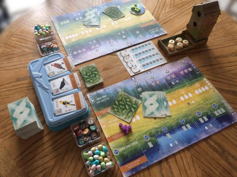
As many of you probably know, I am a very visual person. I love it when rulebooks are well laid out and have helpful photos that show how something works. The graphic design of game and player boards is also something I think is very important. A good choice of clear icons can really help with understanding how a game works and speed up the flow of a turn. Top it all off with beautiful board game art and you have the complete package, if you ask me.
Let me start by saying that in this article I don’t want to ignore people who are blind or who have visual impairments. However, I don’t have any useful experience with vision impairment or blindness. I, like many men, have a type of red-green blindness, but that’s about it. In fact, my colour blindness is quite mild, so I can distinguish between red and green for the most part. So I can’t offer any help to board game publishers about how to make games more accessible.
All I want to say is that it’s easy to assume that you can’t play board games if you don’t have sufficient vision. Yet, most blind people actually still have some level of vision and many people’s vision is somewhere between perfect and fully blind. Also, people’s eyesight naturally degrades with age. So contrast, colour palette, text size and many other graphic design choices are so very important when you want to cater for people who don’t have full vision. Just don’t ask me what those choices should be, because I can’t help with that.
So in this article, I purely want to focus on my experience with the visual elements of board games.
Colourful Illustrations
As I said at the beginning, I’m a very visual person. I love games that have beautiful illustrations. The art you see on the game board, player aids, cards, game box, rulebooks and everywhere else is so very important to me. It helps me immerse myself in the world that the game tries to create.
It is amazing to see so many different styles and ways of bringing the games we play to life. I wonder if there is anyone out there who doesn’t collect games from a specific publisher or designer but instead tries to get every game with a specific illustrator. I suppose Beth Sobel is probably the first name that comes to mind here, probably followed by Ian O’Toole. Both of these artists have contributed to such a large number of games that you could easily have a collection dedicated to them.
However, there is a long list of talented artists in our hobby, all with their own amazing style. You can listen to some of them in my podcast series Let me illustrate, which puts the spotlight on the people who make our games look so gorgeous. I strongly recommend you listen to them talk about their approach to art. Everyone even shares something about themselves that isn’t generally known, their own little secret so to speak.

Get yourself a wooden Tabletop Games Blog dice tray.
Each tray is the perfect size to roll your dice, and with the soft mat, it’s really quiet, while the wooden frame makes it wonderfully sturdy.
Board Game Art in 3D
There is more than just illustrations of course. Wooden tokens, metal coins and plastic miniatures all play a role as well. The 3D element of board games is often overlooked. Table presence is more than just a good-looking game board. A wooden or cardboard dice tower, a nice selection of models or a heap of wooden resources in custom shapes are all important parts.

All of these components have to be shaped in such a way that they’re functional, easy to recognise and help the gameplay. Many of them have to be to scale and fit within certain areas of the game board or slot into a dual-layer player mat. A lot of time and effort is put into getting these 3D components just right. They’re all… well… a work of art.
So even though I’m not a huge fan of too much plastic in board games, I do admire the skill that someone has to make a highly detailed plastic model that is sturdy and looks good on the table. I appreciate how a horde of Viking warriors or an army of tanks can be really impressive and how much fun it is to move them around on the map.
Of course, for tabletop gamers, minis are the lifeblood and plastic scenery is a must. A corsair takes a while to paint fully, but in the end, is just breathtaking. Finishing a whole army of them, while also making trees, preparing buildings and creating obstacles, is clearly a labour of love. Having to get everything ready before you can play is real dedication.
Personally, I prefer to have cardboard standees or tokens, custom wooden meeples or similar. They’re immediately ready. I’m just not a miniature painter.
Eye Candy
So when everything comes together, a clearly laid out rulebook with plenty of useful illustrative examples, great graphic design that ensures actions spaces are easy to see, carefully chosen iconography that is easy to understand, amazing art on the game box, boards and in the rulebook and expertly crafted 3D components, playing a board game goes beyond just being fun. It goes further than being a real joy for the eye. A game can actually become a piece of art in its own right. When everything is just perfect it’s almost as if it’s no longer just a game, but an artefact of cultural importance.
Maybe I’m exaggerating a bit here, but I think we can all name a game or two that is so gorgeous in all its parts that just looking at it is a pleasure. Playing it is almost an unnecessary bonus. It takes a special place on our shelf and whenever it comes out, the excitement is palpable. You have nothing short of reverence for it.
What About You?
Now that I’ve gushed enough about the visual appeal of board games, I want to know what you think. Do you enjoy looking at board games just as much as I do? Do you think board game art is an important part? Maybe you don’t care how a game looks? Please let me know your thoughts in the comments below. I’d love to find out how you feel about it.
Keeping the blog running takes time and resources. So if you can chip in, that would be amazing.
Useful Links
- Let me illustrate podcast series: https://tabletopgamesblog.
com/ let-me-illustrate/
Audio Version
Intro Music: Bomber (Sting) by Riot (https://www.
The following music was used for this media project:
Music: Epic Intro 2017 by Sascha Ende
Free download: https://filmmusic.io/song/558-epic-intro-2017
License (CC BY 4.0): https://filmmusic.io/standard-license
Artist website: https://www.sascha-ende.de


